
Tailwind CSS has become a go-to tool for developers looking to streamline their front-end development process. With its extensive utility classes and flexible customization options, mastering Tailwind CSS can greatly enhance your web design skills. This section will uncover some of the must-know tips and tricks to take your Tailwind CSS proficiency to the next level.
Note: I will keep updating this list.
1. Utilize the Power of Tailwind CSS Peer and Group:
Tailwind CSS's Peer and Group features are game-changers when it comes to controlling the styling of sibling elements and managing related components. These features effectively minimize the need for excessive HTML markup, making your code cleaner and more maintainable. In order to understand this better, let's take a look at the usage of peer class.
See Example Styling based on sibling state (peer-{modifier})
Code of Peer Class
<form class="w-2/3 px-6 py-10 bg-gray-100 rounded-md">
<label class="block">
<span class="block mb-1 text-sm font-medium text-slate-600">Email</span>
<input type="email" name="email" class="w-full px-4 py-2 bg-white border rounded-md shadow-sm peer border-slate-300 placeholder-slate-500 invalid:border-red-500 invalid:text-red-600 focus:border-sky-600 focus:outline-none focus:ring-1 focus:ring-sky-600 focus:invalid:border-red-500 focus:invalid:ring-red-500 sm:text-sm" value="you@example." placeholder="you@example.com" />
<p class="invisible mt-2 text-xs text-red-600 peer-invalid:visible">Please provide a valid email address.</p>
</label>
</form>When styling an element based on its parent's state, mark the parent with the class group and use the group-* modifiers like group-hover to style the target element.
See Example Styling based on parent state (group-{modifier})
Code of Group Class
<div class="max-w-sm m-10 group">
<div class="w-full p-8 transition-all duration-200 ease-linear border rounded-sm ring-1 ring-gray-200 group-hover:ring-2 group-hover:rounded-lg group-hover:ring-blue-200 group-hover:bg-blue-400">
<h4 class="text-xl font-bold group-hover:text-white">Hover me!</h4>
<p class="ml-1 text-xs group-hover:text-white">Tailwind is the best.</p>
</div>
</div>2. Leverage Tailwind CSS IntelliSense for Variables
Make the most of your code editor's IntelliSense capabilities to receive instant suggestions for Tailwind CSS classes. This accelerates your coding process and reduces errors.
To enable Tailwind CSS IntelliSense, install Tailwind CSS IntelliSense extension.
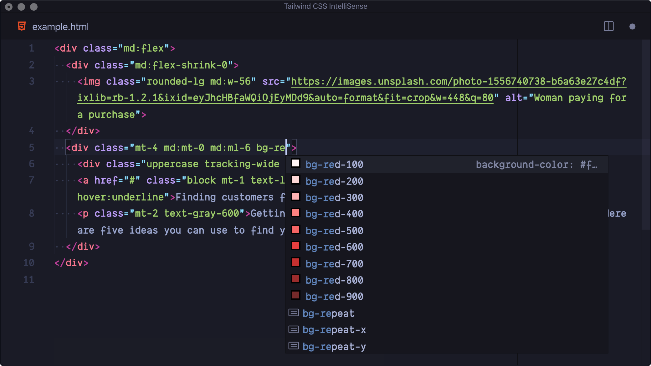
At times, you may wish to store your classes within a variable. However, your Tailwind CSS IntelliSense may not provide autocomplete suggestions or recommendations when creating classes. For example, in a react project, you only receive the autocomplete benefit if you store classes in a variable called className and not in any other variable name such as customClasses.
If you want to activate this feature and have autocomplete suggestions while using a variable name such as customClasses, follow these steps:
- Open VsCode settings or use the shortcut CMD + , on Mac or Ctrl + , on Windows.
- Search for
class attributes - Click on add an item such as
customClasses.
When you write custom classes within the given variable name, IntelliSense will be activated and provide suggestions for possible code completions.
3. Extend Tailwind's Capabilities
Customize your Tailwind configuration easily by extending the tailwind.config.js. This feature lets you add or modify utility classes, giving you full control over your project's design.
Let's consider an example where we require a personalized box shadow class shadow-[0_10px_20px_rgba(240,_46,_170,_0.7)], which will be used in various locations. We can modify the Tailwind configuration and create our custom utility class to avoid repeatedly duplicating the same long classes.
We first need to open tailwind.config.js inside the extend object; we extend the boxShadow utility and create our own utility. The full code example is as follows:
module.exports = {
theme: {
extend: {
boxShadow: {
pink: "0 10px 20px rgba(240,46,170, 0.7)",
},
},
},
plugins: [],
}<div class="m-10">
<div class="grid place-items-center shadow-pink h-44 w-80">
<h4 class="text-xl font-semibold">Tailwind Box Shadow</h4>
</div>
</div>Preview
4. Tailwind CSS Plugins
Have you heard of Tailwind CSS plugins? They are a great way to enhance your development process and make it more efficient. Tailwind CSS offers a variety of plugins that you can use, such as Tailwind CSS Scrollbar Hide, Tailwind CSS Aspect Ratio, Tailwind CSS Line Clamp, Tailwind CSS Forms, and more. These plugins provide additional functionality to your application and can be a game-changer in your workflow. Did you know that we can even create our own Tailwind CSS plugin?
In the previous example, we added a custom boxShadow utility class with a pink shade. However, we are limited by the color options we set in our configuration. To overcome this limitation, we will create a plugin that dynamically generates shadows based on any color we pass or add to our utility class.
- First, open
tailwind.config.jsand import thepluginhelper fromtailwindcss/pluginpackage.
const plugin = require("tailwindcss/plugin")
The plugin helper exposes many tailwind properties and functions that we can use. In our case, we want to get the theme to add the colors and the addUtilities function that will allow us to create our own tailwind classes. We then
plugins: [
plugin(({ theme, addUtilities }) => {
const customUtility = {}
const colors = theme('colors')
for (const color in colors) {
if (typeof colors[color] === 'object') {
const color1 = colors[color]['200']
const color2 = colors[color]['700']
customUtility[`.customshadow-${color}`] = {
boxShadow: `0 10px 20px ${color1}, 0 0 20px ${color2}`,
}
}
}
addUtilities(customUtility)
}),
],So here's what we do - we make this cool new class called .customshadow- that can change its colour based on whatever class is added to it. You can get numerous colour options for your box shadow, but we will only use two for this example. Whenever you need to add a box shadow to your components, simply include the class customshadow- followed by your desired tailwind colour.
Tailwind Merge
Tailwind Merge is a handy utility function for merging Tailwind CSS classes in JavaScript that ensures there are no style conflicts.
Sometimes, we might design a component with a basic structure that will need specific styles to be overridden. Even if we append or prepend new classes, we may observe that the style remains unaffected. To prevent such conflicts, Tailwind Merge helps us by removing the old classes.
Learn more about tailwind-merge
Stay Engaged with the Tailwind CSS Community
Stay up-to-date with the latest developments, tips, and best practices by engaging with the Tailwind CSS community through online forums and communities.
By learning and applying these tips and tricks into your workflow, you can unlock the full potential of Tailwind CSS. So, dive in, and let Tailwind CSS empower your frontend development endeavors.
If you are looking for a Tailwind UI library with a large collection of ready-made components, visit: Material Tailwind